Ethical CRO in Webflow: How to Boost Conversions Without Betraying User Trust
Ever tried to unsubscribe from an email list, only to find yourself in a maze of confusing menus, guilt-tripping messages, and a button so small you’d need a magnifying glass to find it? You’ve just encountered a “dark pattern.” It’s the digital equivalent of a salesperson blocking the exit door.
While these tactics might trick a user into a short-term conversion, they come at a steep price: trust. In the long run, a business built on tricks is a business built on sand.
But what’s the alternative? The answer lies in Ethical Conversion Rate Optimization (CRO), a user-centric approach that focuses on building trust and creating genuinely better experiences. It’s about guiding, not tricking. Helping, not hiding.
This guide will walk you through the world of ethical CRO, show you how to spot and avoid deceptive dark patterns, and provide actionable ways to implement trust-building design right within Webflow.
What is Ethical CRO? (And Why It’s Not a Medical Trial)
First, let's clear up a major point of confusion. If you search for "what is ethical CRO," you'll likely find results for "Contract Research Organizations" companies that run clinical trials. This is a perfect example of how new and underserved this topic is in the web design world.
We’re talking about Conversion Rate Optimization: the practice of increasing the percentage of users who perform a desired action on a website.
Ethical CRO, then, is the philosophy and practice of achieving this by making it easier, clearer, and more pleasant for users to achieve their goals, which in turn helps you achieve your business goals.
Instead of asking, "How can we make more people click this button?", ethical CRO asks, "How can we make the value of clicking this button so clear and compelling that people want to click it?"
It’s the difference between a high-pressure sales tactic and a helpful, knowledgeable guide. One leaves you feeling regretful; the other leaves you feeling confident and respected.
The Rogues' Gallery: Common Dark Patterns to Avoid
Dark patterns are user interface tricks designed to mislead users into doing things they didn't mean to do. They prey on common psychological biases to boost a metric, but they erode brand loyalty in the process. Here are a few of the most wanted culprits.
Roach Motel
This pattern makes it incredibly easy to get into a situation (like signing up for a subscription) but infuriatingly difficult to get out of it. Think hidden cancellation links, mandatory phone calls to customer service, or endless retention surveys.
Why it’s harmful: It traps users and creates a feeling of being held hostage. The moment they escape, they’ll never trust your brand again.
Sneak into Basket
You’re buying a plane ticket, and just before you pay, you notice that travel insurance or a seat upgrade has been automatically added to your cart. This is the "Sneak into Basket" pattern, where items are added without your explicit consent, often using an opt-out checkbox that’s easy to miss.
Why it’s harmful: It’s fundamentally dishonest. It tricks users into paying more than they intended, leading to immediate frustration and buyer's remorse.
Confirmshaming
This tactic uses manipulative language to guilt the user out of making a certain choice. Instead of a simple "No, thanks," the decline option is phrased to make the user feel stupid or irresponsible.
Examples include:
- "No, I don't want to save money."
- "No thanks, I’d rather pay full price."
- "No, I'm not interested in protecting my purchase."
Why it’s harmful: It’s condescending and patronizing. It treats the user like a child instead of a valued customer making an informed decision.
The Ethical CRO Toolkit: Building Better Experiences in Webflow
The good news is that for every dark pattern, there's a bright, ethical alternative that builds trust and fosters genuine loyalty. Better yet, these can be built beautifully in Webflow.
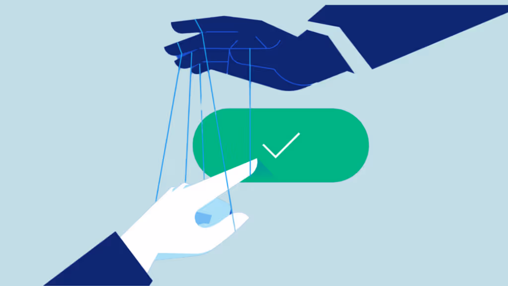
From Roach Motel to a Clear Offboarding
Instead of hiding the exit, make it clear and respectful. A one-click unsubscribe or a simple, easy-to-find "Cancel Subscription" button shows you respect your customer's autonomy.
How to implement it in Webflow:
- Clear UI: Design a user account page with a clearly labeled "Subscription" or "Billing" section.
- Simple Forms: Use a straightforward cancellation button. If you offer a survey to ask why they're leaving, make it optional and easy to skip.
- Honest Confirmation: Provide a clear confirmation message that the subscription has been canceled successfully.
This is a core part of the user experience that often gets overlooked. When building custom Webflow solutions for clients, focusing on a transparent and respectful offboarding process is just as important as the onboarding.
[placeholder for image of a confusing subscription cancellation process vs. a clear, one-click cancellation]
From Sneaky Costs to Transparent Checkouts
Be upfront about all costs. Instead of adding items automatically, use opt-in checkboxes that are unchecked by default. Clearly display taxes, shipping fees, and other charges before asking for payment details.
How to implement it in Webflow:
- Dynamic Cart Summary: Create a checkout summary that updates in real-time as users add or remove items and select shipping options.
- Opt-In by Default: Ensure all add-ons, insurance, and upsells require an active click from the user to be included. Never use pre-checked boxes.
From Confirmshaming to Respectful Choices
Use neutral, clear language for your calls to action. A user declining an offer is not a personal failure; it's simply their choice. Respect it.
Instead of: "No thanks, I hate getting great deals."Try: "I'll continue without this offer" or simply "No, thanks."
How to implement it in Webflow:
- A/B Test Positive Framing: Test different versions of clear, respectful copy. You might find that honest language converts better over time because it doesn't alienate your audience.
- Focus on Value: Your primary call to action should be so compelling on its own that you don’t need to resort to guilt trips for the decline option.
Fixing these issues doesn't have to take months. With a focused approach like rapid Webflow development, you can identify and replace dark patterns with ethical alternatives in a matter of days, quickly improving user trust.
Putting It All Together: A Culture of Trust
Adopting ethical CRO isn't just a design choice; it's a business strategy. Websites that prioritize user trust see better long-term results, including:
- Higher Customer Lifetime Value (LTV): Happy customers stick around longer and buy more.
- Stronger Brand Loyalty: Users who feel respected are more likely to become brand advocates.
- Improved Word-of-Mouth Marketing: People are quick to share negative experiences with dark patterns, but they also share positive experiences with brands that treat them well.
- Sustainable Growth: Your growth is built on a solid foundation of user satisfaction, not short-term tricks.
Think of it as a spectrum. On one end, you have deceptive dark patterns that destroy trust. On the other, you have ethical, user-first designs that build it. Every design decision you make pushes you one way or the other.
[placeholder for 'Trust Spectrum' infographic illustrating the range from dark patterns to ethical design]
Frequently Asked Questions (FAQ)
Is CRO just another name for dark patterns?
Absolutely not. This is a common misconception. Dark patterns are a small, unethical subset of conversion tactics. True CRO is about understanding user behavior to make your website better and easier to use. Ethical CRO ensures this is done with the user's best interest at heart.
Can I still do A/B testing ethically?
Yes! Ethical A/B testing is about finding which version of a design helps users achieve their goals more easily. For example, you might test:
- Which button color is more visible and easier to click?
- Which headline more clearly communicates the value of your product?
- Which layout helps users find information faster?The key is that your goal is to reduce friction and improve clarity, not to deceive.
How do I start implementing ethical CRO on my Webflow site?
Start with a simple audit. Go through your site and look for the dark patterns we discussed. Pay special attention to your checkout process, sign-up forms, and subscription management pages. Then, prioritize fixing the most egregious examples first. Enlisting ongoing Webflow support can also help you systematically identify and improve these areas over time.
Ultimately, ethical CRO is about playing the long game. It's an investment in your relationship with your users, proving that you see them as partners, not just numbers on a dashboard. By building a digital experience on a foundation of trust and respect, you create a brand that people not only buy from but believe in.